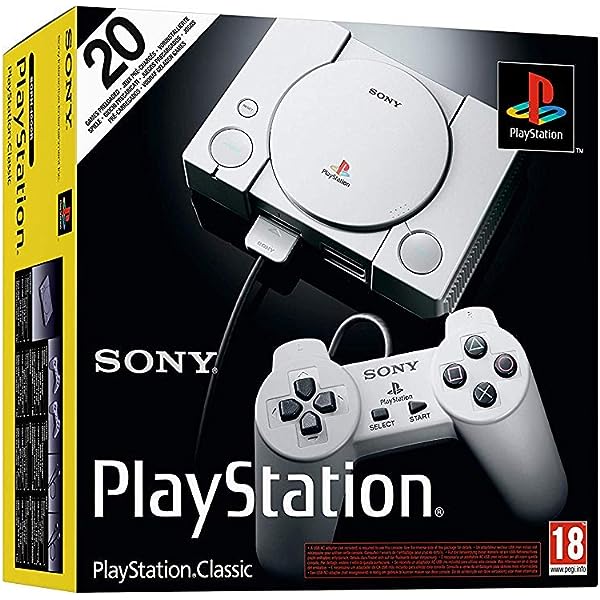
New year, new project: ThinkPad T530

I’ve always been a fan of ThinkPads, dating back to growing up and seeing some of the late-90s/early-00s models around my Dad’s IT colleagues. They’re utilitarian in a way that reminds me of 1980s consumer electronics, like hi-fi components, and I’ve always been nostalgic for that Sony/Kenwood sort of look.

I’ve actually ‘owned’ two previous old ThinkPads, actually: an extraordinarily thick, circa-1997 380D with an original generation Pentium CPU, and a relatively-modern-ish T500, both pulled out of the e-waste garbage at work. Given that neither will really run a modern OS all that happily (and one doesn’t support Windows versions after like, Windows 98SE), they’re fun novelties but not really practical to use regularly.

ThinkPad 380D. Somehow heavier than it looks.

So instead, after getting more sold on ThinkPads and the tinkering possibilities by my girlfriend, I went on eBay and found a T530. It was in solid physical shape, firmly middle-of-the-range for what Lenovo offered, and at a decent price. I threw out a bid, and ended up winning it for $127.50 of my hard-earned dollars, with an additional $28.80 for package and posting from Pennsylvania and $12.50 for the alphabet.

It arrived an understandable amount of time later, as listed, and I was very pleased. Spec-wise, out of the box, it was equipped with the following:

  • CPU: i7-3320M (dual core Ivy Bridge)
  • RAM: 4GB DDR3L-1600 (OEM)
  • SSD: 120GB SATA ADATA SU800
  • 1600×900 15.6″ LCD
  • Wifi: Anatel 1×1 B/G/N Wireless (OEM)
  • ODD: CD/DVD Burner
  • Original (dead) battery
Image 01 - Lenovo ThinkPad T530 Laptop 15.6" i5-3320M 2.6ghz 4GB Ram 120GB SSD Win10 Pro
Pre-tinkering, from the original eBay listing. (biggitybiggims on eBay)

To be honest, I bought it mostly for the chassis and motherboard since those are the hardest/most annoying to source and swap. Getting the 1600×900 screen instead of the (substantially worse) 1366×768 panel was also nice. But pretty much everything else was getting pulled before long.

So, after unpacking and firing it up for the first time, I ran a few tests to make sure everything was working as expected, and then was hand-held through how a tool called 1vyra1n works. It’s basically a BIOS ‘jailbreak’ that grants access to every possible feature available, not just the ones Lenovo wants end users to have. Neat!

Then it was time for upgrades.

First came a SSD swap, pulling out the SATA drive and sticking a 256GB Samsung PM871 mSATA drive in one of the open mini PCIe slot. Out came the basic OEM ram, and in went a 2x8GB kit of properly nice Crucial Ballistix Sport memory. Not just 4x the capacity, but running at a higher clock speed with lower latency. Nice.

Next came a proper OS. This is a Lenovo ThinkPad, and while it was shipped with Windows, had a Windows sticker on the bottom, and has the Windows logo on the keyboard, you don’t run Windows on a ThinkPad. That’s not what they’re for, and if I wanted to run Windows on a laptop, I already have a Surface Pro with Windows 10.

No, this thing got Linux, and in my specific case, it got KDE Neon. It’s basically Ubuntu with the latest and greatest KDE desktop environment and programs. I’ve been a KDE fan forever, and I like getting the shiny new KDE features, so rock on. And since it’s built off Ubuntu (which is already built off of Debian), it’ll run damn near anything that’s been ported to Linux. It also lets me get all fun with the theming and customizations, which of course I did immediately.

Happiness is a customized KDE desktop.

But all of those are still fairly basic, routine upgrades. Those aren’t weird.

The real fun began with the CPU upgrade. Now, one could just go look at the CPUs the laptop shipped with, find the top-tier chip, and buy it off eBay. One could do that and have a very normal, reliable, consistent experience. But that’s extremely boring. Instead, I went on AliExpress and ordered an Intel engineering sample of the i7-3720QM. The finished, actually-released-by-Intel 3720QM is at least twice the power of the original chip, mainly due to the fact that it has four cores, not two. But the one I have is technically Intel’s confidential property from when the 3720QM was still in development. I don’t think they particularly mind that I have it now, given that the final product was publicly released 9 years ago and has long since been discontinued, but it might technically have been stolen property-adjacent. Also it’s not fully guaranteed to work the same as the final product given that it’s a testing sample made while the CPU was in development. But really, that’s a far better story and far more fun.

CPU arrived one standard AliExpress wait later, and it worked exactly as advertised by the vendor in China. Neat!

Next came a few touch-ups to deal with a few of the issues any second-plus-hand laptop would have. The battery was the original battery it came with, and was in bad shape as any 9-year-old laptop battery likely is. Amazon to the rescue with a reasonably-priced equivalent. The laptop was also missing two of its rubber feet and the trackpad sticker was worn out, which again were easily handled thanks to Mr. Bezos’ Rube Goldberg Machine of Suffering.

Next to go was the wifi card, which was fine but basic, the lowest-tier OEM part Lenovo ever used. Instead, I went for an Atheros AR5B22 card. It’s the same spec of B/G/N wifi, but uses fully FOSS firmware (meaning no need for proprietary blobs to work in Linux) and runs a good 5-10% faster than the original card. For $10 or less, it’s totally worth it.

The most recent major component that needed replacing was the keyboard. The one it shipped with was in rough shape. It was bent, the bezel was falling off, and the keys had their coating almost completely gone, making them feel slimy and unpleasant. Any random 30-series ThinkPad keyboard is compatible, and getting a high-grade USA layout keyboard from eBay is quick, easy, and cheap, but again, that’s boring.

No, it’s far more fun to import a backlit dual English/Korean keyboard from AliExpress. Which, of course, I did.

One more standard AliExpress wait later, and the Meme ThinkPad is nearing completion.

There are a few things left I’d like to work on. I have a random 500GB 7200rpm hard drive in here for additional storage which I’d really like to replace with something faster (either hybrid SSHD or SSD) and bigger (1-3TB would be nice), but the storage market is fucked because of Chia Coin mining. So that’s on hold until the dumber side of stupid crypto hype dies down. Instead, I’m going for a screen upgrade. For about $100, I can upgrade to a full 1080p panel with better dynamic range and marginally newer and nicer technology. Since $100 doesn’t go anywhere nearly as far as it should in the storage market at present, that’s a much better quality of life upgrade for the money. Plus, KDE supports proper fractional scaling so I can dick with those settings and upscale a bit. Perfect!

In the end, I’ve ended up with a $150 laptop with about $250 worth of parts in it that performs about as well, CPU-wise, as my current personal Surface Pro 6. Yes, I could have probably just bought a faster laptop for the money, but again, that’s boring and pedestrian and not fun. It’s far more fun to have a project computer that can get upgraded piece by piece into something nicer than it was when it was new, and having that in a laptop is actually practical.

So instead of having regrets, I have the opposite: a literally brand new ThinkPad X230. It’s the T530’s little brother, cramming much of the same features (sans optical drive) into a tiny little laptop. It’s delightful, and the ThinkPad nerds at large have already modded it to hell and back. I can put in ridiculously high-end screens and reworked motherboards and make it almost as fast as its full size sibling. But those parts are more expensive and trickier to get ordered, and they require far more work to install. So for now, I’m cutting my teeth with this one.

Don’t talk to me or my son ever again.

This thing has actually been in use more often than my Surface since I got it, and I love using it. I have my graphic design tools installed, I have Bitwig for working with audio and music projects, and OBS for some video capture. It’s not quite powerful enough to handle editing, but I have both a Surface Pro and a proper desktop that can handle that easily. 90% of what I want to do on a computer can be done happily on here, and it’s just more fun to be running a modded Linux laptop than something stock.

Advertisement

New on SocTakes: Illustrated history of MLS crests: Part II

Hello, Soc Takes crowd. It’s been a while, I know. The pandemic hit, sports got cancelled and my day job suddenly kicked into overtime. But now, the world is looking a bit more normal, and my soapbox needed a good dusting.

You may remember that last January, I wrote a post that was supposed to be the first post in a series on the history of MLS branding. Well, it was, and I guess now still is.

But I digress.

Since Part I was released last January (how time flies!), two more MLS teams have since rebranded, and don’t worry, I’ll definitely be getting to those. I have many, many thoughts on the current state of Montreal and Columbus. However, that’s a future post for future John to forget about and put off for an exorbitant amount of time.

This time, we’ll be looking at the teams that joined MLS between 1997 and 2010, the first major “expansion era” of the league.

Chicago Fire SC/FC

history of MLS crests
1997-2014

Chicago joined MLS as the first announced expansion team, to begin play during the 1998 season. Their inaugural badge got things very, very right. The shape is derived from that of the Saint Florian Cross, the symbol of the patron saint of firefighters, the 6 points are taken from the flag of Chicago, and the colors fit both the theme of the brand and those of the city itself. Honestly, it’s a fantastic logo, and it stuck around for a long time.

2015-2019

Chicago tweaked the team’s color palette for 2015, using slightly more muted shades of blue and red, while leaving the rest of the crest’s appearance unchanged. Honestly, it’s so subtle most people never even noticed it, and that’s some of the best reception a palette revision can have. It still looks clean, just a bit easier to work with across different forms of media, and maybe a bit easier on the eyes.

2020-Present

And then there’s this.

This is why I started this entire project to begin with. Ahead of the 2020 season, the Fire had announced a laundry list of changes that, overall, made the fans extremely happy. Joe Mansueto bought out Andrew Hauptman to take over the team, and then bought out the absurd lease at SeatGeek Stadium to allow the team to return to Soldier Field. The front office was overhauled, the team got a new coach, and things were looking brighter than they had in years. But then the team revealed the new branding. As previously described, the reaction was overtly hostile, and despite being in use for less than a full season’s worth of games, they’re already working on changing it again. Yikes.

But also, yes please, go back.

Miami Fusion FC

history of MLS crests
1998-2001

Remember when MLS had a team in Miami? What’s that, they do again? Yeah? Oh, well, remember the one they used to have?

Yep, the Miami Fusion were MLS’s shortest-lived (so far) team, playing for just 4 seasons out of Fort Lauderdale’s Lockhart Stadium, which is now home to the new Miami MLS team, Inter Miami CF. The irony of none of the Miami teams ever playing a game in Miami itself is lost on no one. Anyway. This badge featured a sunburst-inspired design and a very 90s cyberpunk-ish typeface that definitely didn’t look dated within 5 years. But, with MLS folding both Floridian clubs after the 2001 season, it didn’t even last that long.

CD Chivas USA

2005

Hey, remember the “remember the thing” joke from the Miami section about a defunct team playing in a market and with a similar role to a new team that’s really popular with all those celebrities?

Before there was LAFC, the other Los Angeles team role was filled by Chivas USA, named and branded to match its parent club, CD Guadalajara, better known as Chivas. The idea was to grow the Chivas brands on both sides of the boarder, while hopefully drawing well among the Mexican-American community in Los Angeles.

history of MLS crests
2006-2014

Chivas USA updated their palette in 2006, and for a while, Chivas USA actually out-performed the Galaxy and the cooperation between the Mexican and American clubs actually seemed to be working out. But everything gradually went completely pear-shaped, and culminated in a series of protests (including that time /r/MLS crowdfunded a plane to fly a LED banner above the stadium), and MLS announced in 2014 that they had seized control of the franchise, and sold the rights for a second Los Angeles team to the group that would later form LAFC.

Real Salt Lake

2004-2005

Announced alongside Chivas USA was Real Salt Lake, with MLS expanding to Utah. The brand saw its share of mockery early (what’s so “real” about Salt Lake?), but the logo in general was sufficient, if a bit mid-2000s direct. The club leaned into the crown imagery and the claret-and-cobalt color palette, and quickly built a strong and dedicated following.

history of MLS crests
2006-2009

For 2006, the club slightly tweaked the color palette (a recurring theme, yes), to get a bluer blue, and a softer gold. The change worked well, and the palette would continue after the logo was retired. Wearing this crest, Real Salt Lake won MLS Cup 2009.

2010-Present

In 2010, Real Salt Lake began dropping the club’s full name in favor of the RSL abbreviation, and with that, removed the full name from the logo, resulting in the modern yet familiar and oh-so-clean crest. The color palette was also tweaked a bit, and continues to see some light fluctuations year-to-year, but RSL’s branding has been consistent ever since, even applying to their Real Monarchs USL team, and formerly to the Utah Pride in NWSL.

Houston Dynamo

history of MLS crests
2005 (unused)

“Hey, everyone, look! John’s gonna mention the Earthquakes relocation again!”

Yes, yes I am. The Houston Dynamo weren’t founded in 2006, because there was nothing new to create. The team as a whole was moved from San Jose, CA, joining a long line of Californians moving to Texas because reasons. Originally, the team was to be known as Houston 1836, referring to the year of the city’s founding. However, because of the year coincidentally being when Texas declared independence from Mexico and fought a war for it (remember the Alamo?), there was a bit of controversy, leading to the name being scrapped very early on.

2006-2020

The team was instead named Houston Dynamo, referring to Houston’s long-standing ties to the energy industry, the defunct Houston Dynamos of the original USL (no relation) and Lone Star Soccer Alliance, and a nod to the Eastern European Dynamo sports clubs. Honestly, as much as I hate the team, its origins, and the city it calls home, it’s a clever brand. The logo is nothing particularly special, but it works, and feels sufficiently Houston that the team made it their own in due time.

2021-Present

Ahead of the 2021 season, the Dynamo announced a rebrand of their own, adding to the growing list of logo changes in recent years. In is a new hexagonal crest and interwoven letter mark, with inspiration drawn from the original 6 wards of Houston and the organization’s “founding” in 2006. Accompanying it is a corresponding hexagonal crest for their NWSL side, the Houston Dash. Honestly, they’re not bad. Black and orange are striking, and the Dynamo had been phasing out their use of blue more and more in recent years. Nothing spectacular, but it definitely works, and it’s honestly an improvement in my eyes.

Toronto FC

history of MLS crests
2006-2009

MLS announced it was taking off to the great white north in 2005, with Maple Leaf Sports and Entertainment bringing MLS to Toronto. The Toronto FC name and crest were revealed in 2006, and really nailed it out of the gate. The crest is undeniably Canadian, yet distinctly Toronto, fitting in perfectly alongside the city flag and crest.

2010-Present

For 2010, Toronto tweaked the color scheme, going for a darker shade of red. Nothing else has changed since, because frankly, nothing needs to. With this crest, Toronto grew into one of the strongest teams in MLS, winning a Canadian treble in 2017, and becoming one of the most recognizable brands in MLS in the process.

Seattle Sounders FC

2008-Present

Seattle was announced as an expansion team in 2007, and in line with every major Seattle soccer team dating back to the 1970s, they stuck with the Sounders name. The latest iteration of the Sounders boasts the strongest badge yet, featuring a spectacular silhouette of the Space Needle, and given the strength and quality of the crest, hasn’t been tweaked since. The blue, green, and white date back to the original team’s founding in 1974.

Philadelphia Union

2009-2017

Philadelphia’s team was announced in 2008, and the Union brand and crest were revealed in the Spring of 2009. The branding and crest are tied in heavily to Philadelphia’s role in early American history, with strong nods to the early Continental Army uniforms and Ben Franklin’s Join or Die cartoon. Another team that got things right early.

history of MLS crests
2018-Present

In 2018, the Union decided their badge needed to be brighter, shinier, a little simpler, shinier, and overall, just a lot brighter and shinier. The muted dark gold was replaced with a bright-and-shiny gradient, and the backdrop behind the shield was changed to just vertical stripes. Not entirely sure why they did this, to be honest, but fine, OK, it’s not bad. For whatever reason, this color palette never appealed to me as much as the original. It’s probably the very 2000s looking gradient. That said, though, the club has taken to using variant colors quite a lot, and some of their monochromatic variants have been sharp.

Vancouver Whitecaps FC

history of MLS crests
2010-Present

Vancouver joined MLS for the 2011 season, and like fellow Cascadian heritage brand Seattle, kept the name and color the city’s teams had used for decades. Also like Seattle, they nailed it with their crest out of the gate, featuring a striking symmetrical design of whitecapped mountains and ocean surf. It encapsulates Vancouver oh so well, and still looks just as amazing as it did when it was unveiled. They’ve never changed a thing either, because again, they haven’t needed to.

Portland Timbers

history of MLS crests
2011 (Unused)

Joining the trifecta of Cascadian teams, Portland was announced as an MLS expansion franchise just two days after Vancouver. And when the team revealed the logo above, the reaction was mixed. Quite frankly, I see why. The team had been known for simple, clean, and classic crests, and this one is just far too busy and 2000s. It’s jagged, the contrast feels a bit lurid, and it broke with a long established tradition.

2011-2015

So they changed it before the team even began play, and what an improvement it made. The unnecessary flourishes and jagged edges have been cleaned up, the color contrast is more pleasant, and it feels like there’s so much more room for the design to breathe. It wasn’t perfect, but it definitely made a lot of the fans happy.

2016-2018

Continuing to bring the MLS-era crest more in line with the team’s history, the Timbers dropped all text from the logo and extended the treetop lines to the edges. For such a subtle tweak, it worked so well, and made what was already a great, clean design even cleaner.

history of MLS crests
2019-Present

And finally, in 2019, the club swapped the yellow for classic Timbers gold, and darkened the green to more of a forest green shade, giving us the badge they continue using to this day. It’s among the best in MLS, and draws praise from soccer fans all over the world.

Montreal Impact/CF Montreal

2012-???

Montreal joined MLS from the revived NASL for the 2012 season, updating the Impact branding for their latest iteration. The crest just screams Quebecois to me, from the fleur-de-lis, the use of blue and white, and of course, the French motto “tous por gagner” – all for victory. Despite the slightly 2000s gradients, the crest was sharp, modern, and fit both the team and city perfectly.

history of MLS crests
???-2020

At some point between 2014 and 2020, Montreal began phasing out their original crest for a simplified, flatter design. Gone were the gradients and the motto, in were slightly muted colors. It worked just as well as the original, and retained the majority of everything that worked with the original.

history of MLS crests
2021-Present

Unfortunately, all good things came to an end for the 2021 season. The Impact changed their name to Club de Foot Montreal, which not only sounds stupid in English and in Quebecois French, but is also objectively worse. The distinct and unique crest was replaced with yet another roundel, bringing even more unnecessary homogeneity to the league, and a color palette already on the verge of being too muted now features even less contrast. Reaction was, in line with other recent rebrands, hostile, but it doesn’t seem like the club has any plans to undo the changes.


This concludes the intended portion of Part II of the illustrated history, but since the posting of Part I so long ago, one of the previously included teams has rebranded. So instead of wrapping up here, instead…

It’s time to talk about Columbus.

I attribute precisely three positive changes to the Columbus Crew under Anthony Precourt’s operation: the hiring of Gregg Berhalter as head coach/sporting director, the rebrand, and the sale to the current ownership post-#SaveTheCrew.

The logo unveiled in the Fall of 2014 was excellent. It still is, and the jerseys worn by the team still use it. They wore it as they won MLS Cup 2020, and the club looked to be set for success under new management. And then this happened.

I have several questions, and they’re all “why?” There’s no need for this, and every single person consulted by management agrees. We’ve seen some vitriol against rebrands in the past few years, from some annoyed Houston fans, to angry Impact fans, to the outrage over the Chicago Fire rebrand, but none of it compares to the abject fury among Columbus Crew fans at this. It’s entirely justified.

The team wants to build a globally recognizable brand that will become a historic name, and yet they’ve sacrificed a historic brand that had already built serious brand recognition in the process. All the goodwill built up by the Haslams and Dr. Pete during the #SaveTheCrew saga is at serious risk of evaporating. The team has already put out vague, corporate-speak apologies, and I’m betting that the pressure might be strong enough to actually get them to join Chicago in rolling back a rebrand. Add in the risk of legal issues (identified by fans consulted by the team back in January!) as a long-standing youth soccer team in Columbus, Nebraska, has been using the name for decades, and this rebrand seems doomed to failure from the start.

If MLS and its investors had one lesson to learn from the #SaveTheCrew movement, it’s that soccer fans in Columbus are not to be taken lightly.

This concludes, for real this time, Part II of the illustrated history of MLS crests. Part III will be a quick run through the brands adopted by the latest expansion teams. While there isn’t much to talk about since none of those teams have rebranded, there’s still a lot of interesting history of soccer brands in those markets that I’ll cover.

As always, thanks to Chris Creamer’s Sports Logos for the vast majority of the images used here. I love that site, and spend literally hours scrolling through the various logos and brands used by teams across the world over the years.

Hopefully, the next installment will take less than 16 months to get uploaded.

Follow John on Twitter: @JohnMLTX.

Support Soc Takes on Patreon for access to exclusive content and supporter benefits. Click here to become a patron today.

The post Illustrated history of MLS crests: Part II appeared first on Soc Takes.

from Soc Takes https://ift.tt/3uOs5O9
via IFTTT

New on SocTakes: USL Championship format yields early group standings

USL soccer will make its triumphant return, hopefully, beginning July 11 with a regionalized group system and a reduced schedule. Each team has been divided among eight groups, four for each conference, and will primarily be playing against teams in its own group. Each team will play up to 12 games against members of its group, with up to an additional four games against teams from outside the group but geographically related.

So, with that out of the way, let’s look at the groups.

Western Conference

Group A

  • Portland Timbers 2
  • Reno 1868 FC
  • Sacramento Republic FC
  • Tacoma Defiance

Group B

  • LA Galaxy II
  • Las Vegas Lights FC
  • Orange County SC
  • Phoenix Rising FC
  • San Diego Loyal SC

Group C

  • Colorado Springs Switchbacks FC
  • El Paso Locomotive FC
  • New Mexico United
  • Real Monarchs SLC

Group D

  • Austin Bold FC
  • OKC Energy FC
  • Rio Grande Valley FC
  • San Antonio FC
  • FC Tulsa

Eastern Conference

Group E

  • Indy Eleven
  • Louisville City FC
  • Saint Louis FC
  • Sporting Kansas City II

Group F

  • Hartford Athletic
  • Loudoun United FC
  • New York Red Bulls II
  • Philadelphia Union II
  • Pittsburgh Riverhounds SC

Group G

  • Birmingham Legion FC
  • Charlotte Independence
  • Memphis 901 FC
  • North Carolina FC

Group H

  • Atlanta United 2
  • Charleston Battery
  • The Miami FC
  • Tampa Bay Rowdies

Group standings

In the intro segment, you’ll notice the use of “up to” for the number of games. That’s because every team but Birmingham and Hartford have already played once, with San Diego and Tacoma playing twice before the season was postponed. As a result, those matches will either count as an in-group or out-of-group result for the new schedule. That means we actually already have some group standings.

I’m not going to flood this already lengthy article with embedded spreadsheets of every single group’s standings. I will, however, make a nice little table that includes the relevant information.

group standings
Games played against group and non-group opponents

This table shows which games played were against teams in the group (OPP) and other teams outside the group (OTH). Games highlighted in green were wins, yellow draws and red losses. From this, we can see that Groups A, B, F and H have already played one group game. Meanwhile, the majority of teams will only have three additional games against other opponents.

After the completion of the group stage, the top two teams in each group will then advance to a single-elimination bracket, reducing the playoffs from their originally scheduled 10 teams with a play-in round to eight per conference, essentially reverting to the playoff format last used in 2008.

The USL Championship format helps to reduce travel, but interestingly, they’re not going for the same single-site bubbles that MLS and the NWSL are planning, and given the recent spike in COVID-19 cases, could prove to be a more ambitious and potentially problematic system.

Regardless, the season is set to resume on the 11th, with announcements of group schedules expected this week. Stay tuned for more details as they arrive.

Follow John on Twitter: @JohnMLTX.

Support Soc Takes on Patreon for access to exclusive content and supporter benefits. Click here to become a patron today.

The post USL Championship format yields early group standings appeared first on Soc Takes.

from Soc Takes https://ift.tt/3dNQ1HO
via IFTTT

New on SocTakes: K League explained

k league

Image credit: K League 1

Since the United States and Canada are still under lockdown for the foreseeable future (and no, these soft reopenings in a few states aren’t a sign of things getting better, and are likely to cause even more problems), it’s been quiet around here. Even my in-progress “updating the pyramid for 2020” post has been shelved until we figure out what the hell soccer will look like come August.

So, with all that said, let’s talk about a league that I love that will actually start their season this week, the K League.

If you’re not as invested in Korean pop culture as either I or my colleague Colton Coreschi are, you might not be familiar with South Korea’s national soccer league. Here’s everything you’ll need to know about the K League, its teams, and how to watch.

THE LEAGUE

The K League is technically two linked leagues forming the first and second tiers of the South Korean pyramid. The league was originally founded as a five-team professional competition back in 1983, reorganizing the largely semi-pro/amateur league featuring company-owned-and-operated teams.

The league went fully professional for the 1987 season, shrinking back from a high of eight clubs in 1984 and 1985 back to just five, but by 1995 had regrown to once again reach eight member clubs. Since then, the league has continued to gradually expand and grow, reaching 10 teams in 1997, 12 in 2003 and its peak of 16 teams by 2011.

Late in 2011, the Korea Football Association announced plans to launch a national second-division league for 2013, complete with promotion and relegation beginning at the end of the 2012 season. Teams applied for spots in the new second division K League Challenge with six granted entry, while the top flight was renamed the K League Classic.

For the 2012 and 2013 seasons, two additional teams would be relegated from the first tier in an effort to balance the two leagues and limit each to 12 clubs and evaluate the viability of the six recently admitted teams. Following some financial struggles on the part of semi-pro teams making the jump, the decision was made not to integrate the semi-professional levels with the K League’s promotion and relegation structure.

For the 2018 season, the leagues were renamed to eliminate the Classic/Challenge confusion, with the top tier becoming K League 1 and the second K League 2. Further down the pyramid, ahead of the 2020 season, the various semi-pro and amateur leagues were reorganized and renamed, forming the K3 through K7 Leagues above the regional amateur competitions. Promotion and relegation was also implemented between the K3 League and K4 League, and from K5 down to K7 — all very structured and logical.

Currently, there are still 12 teams in K League 1, while K League 2 has remained steady at 10 teams since 2017. In K League 1, each team normally plays a 38-game unbalanced season featuring three games against each team plus an additional split-table final five games, while the K League 2 normally features a simple 36-game balanced schedule with four games against every team.

The top team in K League 2 earns guaranteed promotion, while the bottom team in K League 1 is relegated. The next three best teams in K League 2 then hold a distinctively Korean climbing-the-ladder playoff. Third and fourth place have a two-game series with the winner advancing to face second place. Following another two-game series, the winner advances to face the 11th-place team in K League 1. The winner of that two-game series gets the spot.

In South Korea, much like in the United States, soccer isn’t the biggest game in town, and the country is firmly a baseball nation. K League attendances look similar to those in MLS or the USL, and players in the top flight earn wages comparable to veteran MLS talent in the $150,000-$200,000 territory.

One more note before we dive into the 22 teams: in Asia, particularly Korea and Japan, it’s common for a sports team’s name to be based more on the corporate owners or sponsors with regional indicators given secondary importance. With that, onto the clubs.

THE CLUBS

For this, since there’s a lot, I’ll be running quickly through each club and its history, in alphabetical order, starting with League 1.

K League 1

Busan IPark

Busan IPark is one of the three remaining teams from the original five back in 1983, and with that comes a history of success, although following the collapse of Daewoo in 1999, the club has struggled. The club was bought by IPark Construction in 2000, which later merged into HDC Group, who haven’t been as willing to spend money as Daewoo was previously. This decline culminated in Busan’s relegation in the 2015 season, followed by three-consecutive failed runs in the promotion playoffs. Last year, Busan put together one of its strongest campaigns in recent years, finished second, and beat Gyeongnam FC 2-0 over two legs to win promotion back to the top flight.

Daegu FC

Daegu FC is one of the recent success stories of a small community club turning things around. After years of lower table finishes from 2003 through 2012, the club was relegated in 2013. In 2016, they put together an incredible season to finish second and were promoted as the best eligible team in the table. Since then, attendance has been climbing, the club has improved its position each of the past three seasons, and they won their first trophy in 2018. They also routinely sell out their new, more intimate stadium. As a community-owned team, the mayor of Daegu serves as chairman with the local populace able to buy in as members. They’re no longer the only government-owned team, but they were the first.

Gangwon FC

Gangwon FC is the first of the “country” teams, playing in the rural and sparsely populated Gangwon Province. Owned by the provincial government, the team usually falls in the bottom half of budgets with one of the smallest markets in Korean sports. Despite early struggles and a relegation in 2013, the club has been back in the top flight since 2017 and has been a reliable mid-table team ever since. Gangwon has one of the smaller fan bases in the league, but they’re fiercely loyal, taking a lot of pride in their rural provincial identity.

Gwangju FC

Gwangju FC has been a quintessential yo-yo club since their debut in 2011. They were relegated in 2012, promoted in 2014, relegated again in 2017, and just recently promoted back after winning the 2019 K League 2 title. So far, their best top-flight finish is eighth, back in 2016. After cycling through five managers across their first seven seasons, former international Park Jin-sub has brought some much-needed stability to Gwangju, and things are finally looking up for the club.

Incheon United FC

Incheon United is an interesting team, known more for a series of controversies, strange managerial decisions and last-minute survival runs than any major results. After finishing a disastrous 12th out of 13 in their first season, the club pulled off a dramatic turnaround under caretaker-turned-full-time-manager Chang Woe-Ryong, finishing second in 2005. They have never made it back to the top three. They made the FA Cup Final for the first time in 2015, losing to FC Seoul. Since then, they’ve finished either ninth or 10th the last four years. Entering their 17th season, they’re already on their 10th full time manager. Despite all that, they’ve never been relegated, and still manage to draw decently well.

Jeonbuk Hyundai Motors FC

  • Founded: 1994 (as Chonbuk Dinos)
  • Home Stadium: Jeonju World Cup Stadium (42,477)
  • Owner: Hyundai Motor Company
  • Manager: Jose Morais
  • League Titles: 2009, 2011, 2014, 2015, 2017, 2018, 2019
  • FA Cups: 2000, 2003, 2005
  • Last season: 1st in K League 1

Jeonbuk were well known for years as a solidly above-average team for much of the late ’90s and into the 2000s. They won a few FA Cups, finished in the top five a few times, and were a good if unspectacular team. Then, ahead of the 2009 season, they reinforced their midfield and signed a man named Lee Dong-gook from Seongnam. Lee too had been good but not great, and yet something crazy happened. Lee and Jeonbuk went on a tear, winning two titles in three years, and became the most dominant team in K League history. Since 2009, their worst finish has been third, they’ve won the league seven times in 11 seasons and wrapped up their third-consecutive title last year. This has led the smaller-market provincial side to build one of the biggest fanbases in the country, and Jeonbuk is easily the early favorite for the 2020 season.

Pohang Steelers

  • Founded: 1973 (as Pohang Steelworks FC)
  • Home Stadium: Pohang Steel Yard (17,443)
  • Owner: POSCO
  • Manager: Kim Gi-dong
  • League Titles: 1986, 1988, 1992, 2007, 2013
  • FA Cups: 1996, 2008, 2012, 2013
  • Last Season: 4th in K League 1

Pohang Steelers are one of the oldest and most consistent teams in the league. Dating back to the factory team era, Pohang have the very apt name of being run for their entire history by POSCO, formerly known as Pohang Iron and Steel Company. They’re a blue collar team from a blue collar town with a blue collar industry, and it permeates their culture throughout. Despite that, they’ve remained remarkably consistent, most recently winning a double in 2013. They’re also the most successful Korean team in the AFC Champions League, winning it on three occasions. They’re not nearly as rich compared to the Hyundai-backed giants, but they consistently punch above their weight.

File:Sangju Sangmu FC.png

Sangju Sangmu FC

  • Founded: 1984 (as Sangmu FC), Refounded 2011
  • Home Stadium: Sangju Civic Stadium (15,042)
  • Owner: Sangju City Government and Korea Armed Forces Athletic Corps
  • Manager: Kim Tae-wan
  • League Titles: N/A
  • FA Cups: N/A
  • Last Season: 7th in K League 1

To explain Sangju Sangmu, I first need to explain the South Korean conscription policy. Due to the fact that South Korea is still technically at war with their northern neighbor, every single adult man must perform compulsory military service, for a time frame ranging from 18 months for active duty soldiers, up to three years for people like lawyers or doctors. Athletes are not exempt unless they meet strict criteria for international achievements, which most don’t. Therefor, the South Korean military runs professional teams in each sport for athletes (even eSports!), with Sangmu serving as the military team in the K League. Each year, 15 young athletes join the team for a two-year loan, concurrent with their military enlistment, and once they complete their mandatory service, they’re free to return to their original clubs. This means that Sangmu doesn’t really focus on its identity or competing for trophies much, and they usually find themselves in the bottom half of the table.

Seongnam FC

  • Founded: 1989 (as Ilhwa Chunma)
  • Home Stadium: Tancheon Stadium (16,146)
  • Owner: Seongnam City Government
  • Manager: Kim Nam-Il
  • League Titles: 1993, 1994, 1995, 2001, 2002, 2003, 2006
  • FA Cups: 1999, 2011, 2014
  • Last Season: 9th in K League 1

Seongnam have moved around a good bit since their launch, as part of the K League’s campaign in the early ’90s to distribute teams outside of just the Seoul core. Before their move, they won three in a row, and then after their first move to the city of Cheonan, they won three in a row again. Since then, they’ve been sold from their corporate founders Ilhwa to the city of Seongnam, becoming another community owned team under the Seongnam FC name. Results have been mixed, with an FA Cup win in 2014 and a second-place finish in 2018 interspersed with a narrow escape from relegation in 2016. They have been able to build a more consistent name for themselves as a Seongnam-specific team, capturing that specific satellite city of Seoul, but sill struggle for attention against the nearby giant in FC Seoul.

FC Seoul

FC Seoul are the most popular, best-drawing team in the country, with a long history dating back to the mid ’80s, and yet despite their support and their owner’s unusually deep pockets, success hasn’t been consistent for the team. The team was a pawn for years during the merger of Goldstar and Lucky to form LG, and then the separation of GS Group as a separate entity in the mid-2000s. Since then, chairman Huh Chang-soo, owner of GS Group, has been reluctant to spend money on his team, leading in 2018 to FC Seoul facing its first relegation playoffs. Chairman Huh has been accused of meddling in team affairs and managerial decisions, much to the fanbase’s chagrin. That said, they’re still a consistent threat even with their relatively small budget.

Suwon Samsung Bluewings

Suwon was created specifically by Samsung to be their team right by several of their major headquarters, and with that came a lot of money. The big spending saw Suwon win two titles early, but since then, success has been a lot more sporadic and the corporate owners have tightened the budget. This has left the Bluewings competing more for the Korean FA Cup in recent years, winning two of the past four, and simply hoping for the best in the league table. That said, they remain one of the more popular teams in the country, and are the second biggest team in the Seoul area.

Ulsan Hyundai FC

The other Hyundai-backed team, Ulsan Hyundai hasn’t been nearly as absurdly dominant as their corporate cousins, with the dubious honor of more second-place finishes than any other team at eight. They have won their two championships, and they’re rarely out of the top six, but there’s been a bit of a little brother vibe compared to Jeonbuk. The Ulsan faithful however have consistently turned out for their team for years, and they routinely rank in the top four in attendance. Given how agonizingly close Ulsan came last year, literally losing the title by a single goal scored, don’t count them out.

Follow John on Twitter: @JohnMLTX.

Support Soc Takes on Patreon for access to exclusive content and supporter benefits. Click here to become a patron today.

The post K League explained appeared first on Soc Takes.

from Soc Takes https://ift.tt/3dslMGK
via IFTTT

New on SocTakes: Big year ahead for NPSL

NPSL
Photo credit: NPSL

The NPSL is set for one of its biggest, longest and most exciting years yet, with a number of changes coming as discussed in a call with NPSL treasurer and Virginia Beach City FC owner Steven Wagoner.

For starters, the league’s grand fall-spring extended season originally announced last November is coming, with announcements expected as the NPSL’s summer season grows closer. The season is expected to begin roughly a year after the launch of the Members Cup, starting sometime between mid-August and early September. The current plan looks much larger than last year’s Members Cup, with plans for regional conference play much like the current NPSL summer format. The major determining factor over which teams will participate is whether there are enough involved to create a regional full-season conference. According to Wagoner, enough teams have expressed interest for the league to launch this year, with play set to begin this fall.

The new season will continue to be amateur, with a greater focus on expanding rosters beyond college athletes. While previous proposals from the NPSL have included professional spin-off tournaments, the departure of several prominent teams to NISA has led to a refocusing on the same sort of system already in place for the NPSL. Applicants are already being vetted and accepted internally, with stricter standards in place for full-season teams compared to summer-only ones. The intention remains for the full season to be an option for teams that choose to participate rather than a change in focus for the league as a whole, although teams that join the full season will still participate in the shorter summer seasons.

While the league initially planned to launch the extended season this upcoming March, departures of several Members Cup teams to NISA along with a desire for more thorough vetting and a larger initial launch has led the league to push the launch until after the conclusion of the 2020 NPSL summer season. As such, the inaugural extended NPSL season is expected to conclude after the opening rounds of the 2021 Open Cup.

Expect more announcements on the extended season closer to May, with teams announced over the summer and the schedule released closer to August.

As for the NPSL’s 2020 summer season, the full schedule is expected near the end of February or beginning of March, with several conference schedules already released.

Follow John on Twitter: @JohnMLTX.

Support Soc Takes on Patreon for access to exclusive content and supporter benefits. Click here to become a patron today.

The post Big year ahead for NPSL appeared first on Soc Takes.

from Soc Takes https://ift.tt/2ujXuxL
via IFTTT

New on SocTakes: Soc Takes Pod Ep. 63: American amateur soccer rundown

Soc Takes Pod co-hosts Colton Coreschi and John Lenard pick up where they left off in Episode 62, this time sizing up all the recent amateur soccer happenings stateside as well as the 2020 edition of the U.S. Open Cup.

Support Soc Takes on Patreon for access to exclusive content and supporter benefits. Click here to become a patron today.

The post Soc Takes Pod Ep. 63: American amateur soccer rundown appeared first on Soc Takes.

from Soc Takes https://ift.tt/39unVzV
via IFTTT

New on SocTakes: Soc Takes Pod Ep. 62: American soccer roundup

The Soc Takes Pod returns for the new year with co-hosts John Lenard and Colton Coreschi providing an American soccer rundown on the men’s side. Listen in as they bring you up to speed on all the significant offseason happenings in MLS, the USL, NISA and more.

Support Soc Takes on Patreon for access to exclusive content and supporter benefits. Click here to become a patron today.

The post Soc Takes Pod Ep. 62: American soccer roundup appeared first on Soc Takes.

from Soc Takes https://ift.tt/2GsKhVQ
via IFTTT

New on SocTakes: Illustrated history of MLS crests: Part I

MLS crests
Image credit: MLS

With Chicago’s recent rebrand announcement receiving a, shall we say, openly hostile reception, we’ve gotten to talking about soccer logos in the Soc Takes group chat. It’s a common pastime for us, much like any other members of #SoccerTwitter, and this got me thinking about the various brands and rebrands we’ve seen in MLS since its inception in the mid-’90s. MLS itself has gone through a handful of different logos in its history, before settling on the current design in 2014.

For this mini-series, we’ll be going through MLS teams in a quasi-chronological order, starting with the original Class of 1996, continuing with the teams launched between 1997 and 2010, onto the latest batch of expansion that began with New York City and Orlando in 2013, and wrapping up by looking at the latest logos to be revealed for the teams yet to enter MLS.

Illustrated history of MLS crests

Major League Soccer

1994

We begin back in 1994. The World Cup had finally come to the United States, and with it, the requirement from FIFA for a top level professional league. As excellently documented by Beau Dure in his book “Long Range Goals,” MLS won the bidding by USSF to become that league, and launched in 1994 with 10 teams ready to go, and another two just a few years away. The league adopted a logo inspired by those of the NBA and MLB, with a red, white and blue color scheme and a relevant athletic silhouette, but this logo would be scrapped before the announcement of the inaugural 10 teams.

1995-99

MLS instead adopted a unique blue and green palette, a simple color swap of the original logo, setting the tone for their branding for the next two decades. This was the logo used at the public reveal of the founding markets and teams, and was carried over for the league’s first three seasons. While MLS was originally slated to kick off in 1995, a few operational delays forced the start back one year, with the league deciding that it was better to have a well-organized, well-prepared launch than to rush into things.

2000-07

For the 2000 season, much like nearly every major brand on the planet, MLS updated its logo for the Information Age™, adding more detail and shading to the boot and ball along with a thick black outline. An alternate logo, missing the “MAJOR LEAGUE SOCCER” wordmark, was also used, particularly online and in graphics. This fundamental design would prove to be the longest lasting branding used by the league.

2008-14

The next revision was even subtler, simply adopting the previous alternate logo as the league’s new primary branding, carrying over the same fundamental idea for another seven seasons.

2015-Present

In September 2014, MLS unveiled a complete redesign of all its branding, adopting a new primary crest and numerous palette-swapped variants, with one for each member club. The new logo also launched the wonderful trend of PR-speak branding guidelines, stating that the three stars stood for club, country and community, and the upward sloping line representing MLS’ pathway into the future. Onward and upward, literally.

Colorado Rapids

1996-99

The Colorado Rapids launched with a very ’90s brown and blue color scheme, and a logo that more resembled a minor league baseball team than professional soccer. This would end up being among the longest-lived brandings for the original 10 teams, with only New England’s controversial flag and Columbus’s hard hat trio lasting longer.

2000-07

For 2000, the Rapids made some subtle tweaks to their colors, settling on new shades of gold and blue. They also began to make more frequent use of a roundel secondary crest, though it was never considered a primary brand.

2007-Present

Colorado’s only substantial overhaul settled on their still-active primary brand in 2007, adopting a completely new color palette inspired by the other Kroenke-owned Denver-area sports teams, and brought the Rapids more in line with conventional soccer aesthetics.

Columbus Crew

1996-2014

Much has been said about the Crew’s original logo. References to The Village People, attempts to identify the three men pictured, the adoption of hard hats as fan ware, you name it. It never featured the city in which the Crew played, and even referred to them by “the Crew.” Peak 1990s aesthetic.

2014-Present

Considered by me to be the only positive lasting contribution made by former investor-operator Anthony Precourt, Columbus adopted a roundel design in 2014 as the first major change to their visual identity. Also changed were the shades of black and gold, with a much brighter yellow made the primary color and the shade of black set as a very dark shade of grey. It’s honestly still one of my favorite logos in MLS, and there’s a reason that the new owners haven’t touched it.

Dallas Burn/FC Dallas

1996-2004

“OK guys, we’ve got to figure out the branding for this new Dallas team. What’s iconic about Dallas?”
“Well, they ride a lot of horses in Texas, right? How about something with a horse?”
“Genius! But it’s 1995, baby, we need to be modern! Hip! Edgy! With it!”
“Well, it’s hot as hell in Texas, so what about the Burn? Because stuff that burns is really hot! And maybe the horse is breathing fire!”
“Perfection! You’re getting a raise, kid. No, a promotion!”

2005-Present

By the summer of 2004, the Burn had broken ground on a new stadium in the suburb of Frisco, and as part of the move to their own purpose-built home, the team completely rebranded. Gone was the name, Burn, and with it, the fire-breathing horse. Dallas needed something that screamed soccer, and Texas, and what better than to simply call the team FC Dallas and feature a Texas Longhorn cow on a red, white and blue shield? While the logo received a lukewarm reception in 2004, it’s proven decent enough and still holds up alongside the latest and greatest offerings from around the league.

Fun fact, the team has never settled on standard shades of red or blue.

D.C. United

1996-97

D.C. United’s original logo drew immediate comparisons to totalitarian symbolism. There’s nothing wrong with using an eagle as a prominent symbol, but the way they went about it felt more-than-vaguely fascist. Apparently, the criticism worked, because after just two seasons, D.C. gave it another go.

1998-2015

Ah, much better. While the general idea remained the same, D.C. opted for a much more American take on an eagle motif, and adjusted the crest’s shape and typography to look a good bit cleaner. This would end up lasting almost as long as RFK Stadium, and D.C. won the bulk of their trophies with this crest on their jerseys.

2016-Present

As ground broke on D.C.’s forever home, the team once again changed hands, and decided to update their crest as it entered a new era. The basic idea of the eagle with outspread wings stayed, but with a much more modern design, a brand new and really rather lovely typeface, and a nod to the District’s amazing flag across the eagle’s body. As far as I’m concerned, they nailed it here.

Kansas City Wiz/Wizards/Sporting KC

1996

This was Kansas City’s actual name and logo at their launch, straight out of a Zima-fueled bender in 1995. It’s amazingly terrible, and I unironically ironically love it. Soon after the team’s debut, there was a bit of a friendly rivalry with their neighbors to the south, with plenty of definitely subtle references to sexually transmitted diseases. Wiz vs Burn, anyone?

MLS crests
1997-2006

Kansas City lengthened Wiz to Wizards for their sophomore season, thanks in no small part to threats from the now-defunct “The Wiz” electronics chain, and stuck with it for over a decade. The uber-vivid colors were muted a touch, but the flashy magic rainbow aesthetics remained core to the team’s visual identity well into the 2000s. I still can’t believe that this actually happened.

2007-10

In 2007, as MLS entered the Beckham era, Kansas City decided they needed to update their branding as well, but rather than ditching the delightfully absurd Wizards moniker, they merely de-rainbow-fied themselves. This would last a few seasons longer than the original Wiz idea, coinciding with the team’s move from the colossal Arrowhead Stadium to an independent league ballpark in the suburbs.

MLS crests
2011-Present

Fortunately, Kansas City was sold to committed and savvy new investors in 2007 who had big plans for the team. A new stadium, a new name and, of course, a new logo. They chose Sporting Kansas City, initially as part of a united “Sporting Club” that ultimately never came to fruition, but gave the team a fantastic logo that still ranks among the best in MLS.

LA Galaxy

MLS crests
1996-2002

What the hell were people doing in the ’90s, honestly? I get the idea of Galaxy for Los Angeles, it’s a cluster of stars, and the spiral galaxy motif makes some logical sense, but the Galaxy were one of the more aggressively ’90s-tinted teams. This design would actually last for over a decade with only a minor adjustment to the colors.

MLS crests
2003-06

They actually managed to take their goofy design and make it worse, with a less attractive shade of green. Fortunately, they soon figured things out, decided to act like a big-time LA team, and made a few changes that would define the team for the next decade and change.

MLS crests
2007-Present

How do you achieve relevance in a crowded, competitive and often fickle sports market? For the Galaxy, they built a new stadium, signed David Beckham and Robbie Keane, and adopted a logo that was in no way derivative of Real Madrid. Long before adopting this crest, LA had made the diagonal sash their look, and with the bright new logo and color scheme, the white and blue came to symbolize success and fame in MLS.

New England Revolution

MLS crests
1996-Present

There are times where a team gets their branding right the first time, and never needs to change a thing. This is not one of those times. Even back in 1996, New England’s logo was mocked, likening it to a crayon drawing. Little has changed on either side, with the team merely adding/removing the wordmarks as needed and slightly tweaking the palette, and the fans and pundits continue to point out how bad it looks. Team leadership has said that they’ll rebrand when they open a stadium of their own, but even that’s been in development hell for over a decade. We’ll see if they ever actually do either.

New York/New Jersey MetroStars/MetroStars/New York Red Bulls

1996-97

Would a team by any other name still get acknowledged as playing in New York City? Apparently not, but they still tried. The New York/New Jersey MetroStars, slash and all, were the original NYC representatives in MLS, featuring a name inspired by the team’s original owners, Metromedia. When people point out that they’re so blatant about their corporate ownership, just point to that fact and say it’s always been like this.

MLS crests
1998-2005

Oddly enough, though, the MetroStars name resonated with fans, and even after dropping any geographic marker in the name, the MetroStars brand lasted quite a while. A vocal minority even prefer this era’s branding to the current Red Bulls era. And for any Atlanta fans reading this, the MetroStars were the original Five Stripes, red, black, gold and everything.

2006-07

Can you guess who bought the team in 2006? I’ll give you three hints. They’re a major energy drink company based in Austria, they’re inspired by a famous Thai energy drink named after a crimson cow and they’re well known for their involvement in the more “extreme” side of sports.

Red Bull were unbelievably blatant and coarse with their changes after taking control, completely erasing the MetroStars history, and stamping their corporate logo on everything, much to the chagrin of longtime fans.

MLS crests
2008-Present

When Red Bull updated their corporate imagery in 2008, they applied it to their various sports properties, RBNY included. The updated logo toned down the “extremeness” of the bulls, simplified the sun design in the center, and darkened the color palette. This same branding would be applied to the team’s new stadium, to be known as Red Bull Arena.

That said, there’s been some talk of Red Bull selling the stadium and/or team in the near-enough future, so maybe this logo won’t be around in a few seasons.

San Jose Clash/Earthquakes

MLS crests
1996-99

Part of the inspiration behind the launch of MLS was a step away from the mistakes of the NASL. The league made a concrete effort to avoid reusing branding and to make it crystal clear that they weren’t going to be a repeat of the past. This meant that the iconic San Jose Earthquakes name was passed over in favor of a new idea, which for some reason involved scorpions. I don’t know, blame Nike.

NASL-era Earthquakes
San Francisco Bay Blackhawks

Another idea proposed by the team’s original owner was a continuation of the San Francisco Bay Blackhawks, a team founded in 1989 following the folding of the original Earthquakes. The Blackhawks became one of the rare powerhouse teams of the late ’80s and early ’90s, producing a number of USMNT players and notably advanced into the second stage of the 1992 CONCACAF Champions Cup, before falling 4-3 to Club America. Unfortunately, Blackhawks/Clash owner Dan Van Voorhis had some financial and legal trouble that saw him hand his MLS team back to the league before the league officially launched.

2000-04

In 2000, with the team under control of the former owner of the NASL Earthquakes, the Earthquakes name was revived with a new blue, black and white scheme. This proved to be much more popular with fans, both those who remembered the original team and newer fans who hated the Clash branding. The team quickly went on a tear, winning two MLS Cups with the new name and logo.

2005

The Earthquakes logo received a fresh coat of hex color codes for 2005 and proceeded to storm to their first Supporters’ Shield, but off the field, owners AEG had other ideas. At the end of another successful season, the team packed its bags and moved to Houston, with the promise that MLS would return to San Jose in a few years once the situation was better.

MLS crests
2008-13

Following two seasons where the former Earthquakes won two championships in a different city, MLS brought the Earthquakes back from the dead with new owners, a new home and new logo. These revived Earthquakes won another Supporters’ Shield and saw the rise of Chris Wondolowski as the face of the new era, alongside plans for a proper stadium for the future.

MLS crests
2014-Present

As the Earthquakes broke ground, at long last, on their new dedicated stadium, the team followed in the footing of recent MLS trends and rebranded to mark a new era. Strangely, the name Earthquakes was abbreviated to simply Quakes, even though a matching EarthQuakes wordmark was created and has been used by the team. The new crest received a lukewarm reception, mainly stemming from the abbreviation, but has lasted through six seasons and revived interest in the team.

Tampa Bay Mutiny

MLS crests
1996-2001

MLS owned and operated the Tampa Bay Mutiny for all six seasons of the team’s existence, all under an unusual video game and sci-fi-inspired crest featuring some strange mutant alien creature that Nike claimed would control the ball with its mind. Sadly, the team’s move to Raymond James Stadium in 1998 came with a rather horrid lease, and attempts to convince Malcolm Glazer to buy the team failed, with him instead deciding to buy a community team in northern England, and MLS decided after the 2001 season to fold both Florida teams.


This concludes Part I of this comprehensive look at the history of MLS crests and branding. Part II picks up where we left off with the two expansion teams from 1998, and continues through the teams announced by 2011. Part III will then begin with New York City FC and Orlando City SC, and continue through the present.

As always, a massive tip of the hat goes to Chris Creamer and SportsLogos.net, one of my favorite resources for sports design history. If you’re at all curious about the history of branding in sports — and judging by the fact you read this far, you are — go check the site out.

And if you like this sort of stuff, check out a piece that inspired the escalation of my original commentary on the Fire’s new branding, written by Buzz Carrick over at 3rdDegree.net two years ago.

Follow John on Twitter: @JohnMLTX.

Support Soc Takes on Patreon for access to exclusive content and supporter benefits. Click here to become a patron today.

The post Illustrated history of MLS crests: Part I appeared first on Soc Takes.

from Soc Takes https://ift.tt/38uuRfH
via IFTTT

New on SocTakes: Front Porch Discourse: How did FC Cincinnati get it so wrong?

In the latest episode of Front Porch Discourse, co-hosts John Lenard and Ian Foster discuss the pitfalls of FC Cincinnati‘s expansion season, comparing them to the decade’s other lower-leagues-to-MLS transitions. But first, they take on how the media seemed to completely underestimate Jill Ellis and the USWNT in 2019.

Follow Front Porch Discourse on Twitter: @FPDiscourse.

Support Soc Takes on Patreon for access to exclusive content and supporter benefits. Click here to become a patron today.

The post Front Porch Discourse: How did FC Cincinnati get it so wrong? appeared first on Soc Takes.

from Soc Takes https://ift.tt/35zS7YJ
via IFTTT

New on SocTakes: Rethinking Open Cup format

Open Cup format
Things get testy between the Indy Eleven and Lansing Ignite FC in the 2019 U.S. Open Cup. Photo credit: Robbie Mehling/Soc Takes

Well hello there, Soc Takes. It’s been a while.

You may have noticed my as-of-yet unexplained absence the past few months. To make a long story short, I got dumped, took some vacations, got a promotion at work, met a new girl and went to a lot of soccer games. But enough about that, it’s time for this hiatus to end, and what better way than with a #HipsterManifesto on the Open Cup format.

The 2019 Lamar Hunt U.S. Open Cup is finished, with chaos and drama and #Cupsets aplenty, and a new champion in Atlanta United. And that’s got me thinking about how the tournament itself is structured. With the growth of the professional game, between expansion in MLS and the USL Championship, the formation of USL League One and the advent of a new professional league on the horizon, there’s been a decline in the number of amateur teams making the tournament. Last year, we had 55 amateur sides competing; this year, just 32.

And next year, that number could drop even further. Between MLS adding two more teams, USL League One adding three teams and a high likelihood of the teams from NISA and possibly even NPSL Pro (should it survive) joining, we could see under 30 amateur sides qualify unless the format is modified.

Right now, after local qualifiers, all the amateur sides join in round one, along with the eligible clubs in USL League One. That makes for 38 teams playing a total of 19 games. USL Championship teams enter in the second round, for a total of 44 teams and 22 games. The third round continues without adding any more teams, simply pitting round-two winners against each other to determine the 11 teams that will take on MLS opposition in the fourth round. At that point, there’s 32 teams in total, and it’s a direct knockout bracket all the way to the final.

I have a few issues with this format. First off, MLS teams stay out of the hunt until the end, ensuring a heavy MLS presence from the round of 16 onward. Second, as professional leagues form or expand, they’re taking spots away from amateur sides. Third, there’s a heavy imbalance in the participation from round to round until the fourth round. Fourth, we often see MLS teams hosting lower-division or amateur sides, which shifts the costs of travel onto those who can less afford it.

Let’s fix all of these, and more.

Expanding the tournament

First up, the biggest point is to dramatically expand the tournament’s size. Just looking at the three current professional leagues, there will be a total of 75 professional teams in 2020 and at least 78 by 2022. Add in NISA’s 13 announced teams and that takes us to 88 next year and 91 after that. Even if we remove the ineligible B teams, we’re rapidly approaching 75 eligible professional teams, and could end up there by 2022 easily. The tournament, quite simply, needs to get a lot bigger and needs to rethink how teams are paired.

My first proposal begins with a dramatic expansion to 192 teams every year, divided into four regional groups of 48. Most of these additional teams will come from what used to be the local qualifying tournament, and will simply directly join the tournament outright. This lets us bring 32 teams from each of the NPSL, USL League Two and UPSL, and a fluctuating number of additional local teams from outside the “organized amateur system.”

The second major change involves moving the entrance of professional teams much earlier and the introduction of seeding for professional sides. Each regional bracket will contain 16 seeded teams that get a single-round bye, whether they play in MLS or the USL. Take all of the professional teams in a given region and sort them by points per game from their previous season. This way, teams that aren’t MLS sides can be rewarded for a better performance in league play, and MLS sides that aren’t performing get penalized with a quasi-play-in game. The top 16 teams from this ranking are seeded, and should there be fewer than 16 professional teams in a regional bracket, apply the same formula to the amateur sides to reward the top few performers there.

Now, we have our first two rounds set. Thirty-two teams enter in each region for the first round and the 16 winners advance to face the seeded teams. Instead of waiting until halfway through the tournament for the final participants to join, every single team will have played a game by the end of the second round. The regional groups remain for the third and fourth rounds, with 16 and eight teams playing eight and four games, respectively, per group. Once the final 16 are set, the groups combine for a final 16 knockout tournament, resuming the current format until the final.

Now, before the criticism begins about the lack of referees to officiate games involving professional sides, I actually have a solution. There’s no need to hold the entire first three rounds in 48-hour windows, and staggering these with games held across a two- to three-week window will help alleviate fixture congestion and stadium availability concerns, and ensure a sufficient number of officials. And since this modified format doesn’t actually add any rounds to the tournament, only games, it’s not much different than simply having more midweek Open Cup nights.

Although, on that point, there’s been some demand to move Cup ties to the weekends, and honestly, I agree. Particularly for amateur sides, many of which have players working full time, availability on Tuesday and Wednesday nights is tough, and it’s far easier to request the professional sides to play their league matches midweek to free up time for the Open Cup. MLS and the USL might not like it, but it helps more teams take the tournament seriously and should be strongly considered.

Onto the topic of hosting: Why is there a preference to MLS and USL Championship sides hosting? It adds to the expense for amateur sides, having to pay to travel, and costs those smaller teams a significant amount of gate revenue. Five thousand tickets sold on a Wednesday is a nice little bonus for the likes of FC Dallas, but would be a windfall for a team in the NPSL or lower. Expecting amateur sides to foot the majority of the upfront costs just to participate is absurd, and this sort of change would help end the reliance on things like GoFundMe for these clubs.

On that front, even when amateur sides need to travel, it’s not that crazy to request the USSF to cover the costs. These expenses are handled at the federation level in other domestic cups around the world, and the USSF definitely has the money for charter buses and the odd flight. And if they don’t, they could follow the FA’s footsteps and sell commercial branding rights to the tournament. Maybe even get American Airlines as the title sponsor and work out an arrangement for discounted airfare for teams.

Now, a lot of this is hypothetical, and this plan isn’t completely foolproof nor ready to implement in its current form, but it’s the sort of thinking I wish we’d see from the federation. With the move to ESPN+, we saw more serious media coverage than ever before, and the more they talk about it and promote it themselves, the more seriously teams treat it. This year was one of the most competitive, dramatic tournaments in recent history, and things are absolutely trending in the right direction. I simply want to see this continue in ways that solve some of the serious lingering problems.

Also, thanks for reading, and I’m glad to be back.

Follow John on Twitter: @JohnMLTX.

Support Soc Takes on Patreon for access to exclusive content and supporter benefits. Click here to become a patron today.

The post Rethinking Open Cup format appeared first on Soc Takes.

from Soc Takes https://ift.tt/2LmiQze
via IFTTT